Neutral palettes have long been the backbone of elegant, timeless interior design, fashion, and art. Synonymous with sophistication and versatility, neutrals such as beige, grey, taupe, ivory, and soft browns provide a calming backdrop that never goes out of style. Yet, despite their classic appeal, neutral palettes are sometimes dismissed as dull or uninspiring. The secret to crafting a neutral scheme that feels lively and engaging lies in the deliberate choice of shades, the interplay of textures, and a thoughtful layering of elements.
Understanding the Neutral Spectrum
Neutrals are, by definition, colours that lack strong chromatic content. They are often thought of as ‘background’ shades—white, black, grey, beige, taupe, cream, and brown. However, within each of these families exists a vast range of undertones and intensities, from cool blue-greys to warm honeyed creams.
White: From stark brilliant white to softer shades like chalk, ecru, or antique ivory.
Grey: Cool blue-greys, green-greys, and warm greige (grey-beige) tones.
Beige/Taupe: Think of sandy hues, mushroom, oatmeal, and stone.
Brown: From pale biscuit to deep chocolate and earthy espresso.
Black: Charcoal, graphite, and off-black.
Tip: When selecting neutrals, always consider the undertone (cool vs. warm) and how it interacts with the natural light in your space or the complexion in fashion.
Building Depth with Layered Neutrals
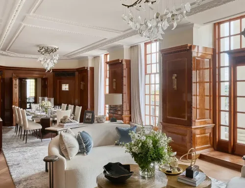
The key to an engaging neutral palette is depth. Rather than relying on a single shade, layer multiple neutrals that are subtly different. This approach adds dimension and avoids the flatness that can make a neutral scheme feel lifeless.
How to Layer Neutrals:
Choose a Dominant Shade: Start with a base neutral—perhaps a soft warm grey for walls, or camel for a coat.
Add Supporting Shades: Introduce two or three complementary neutrals, varying in warmth, intensity, and value (lightness or darkness).
Contrast and Balance: Use a mix of light, mid, and deep neutrals. For example, pair a creamy white with a mid-tone taupe and a deep charcoal accent.
Highlight with White or Black: Crisp white or rich black can act as punctuation marks, bringing sharp contrast and clarity.
Experimenting with Texture and Material
Texture plays a vital role in making neutral palettes interesting. Without the distraction of strong colour, texture comes to the fore, adding tactile richness and visual interest.
Ideas for Layering Textures:
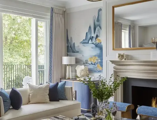
Interior Design: Combine linen, wool, leather, wood, and stone. For example, a boucle sofa, a jute rug, and a polished marble table.
Fashion: Mix cashmere with denim, suede with silk, or wool with cotton.
Art and Graphics: Use paper type and print finishes—matte with gloss, or rough with smooth surfaces.
Layering different textures within similar shades creates a scheme that feels both cohesive and dynamic.
Playing with Pattern and Shape
Patterns, even in subtle or tone-on-tone formats, can bring energy to a neutral palette. Consider stripes, checks, herringbone, or geometric motifs in soft greys and beiges. Patterns can be bold or understated but should remain harmonious with the overall neutral scheme.
Shape is equally important. In interiors, a curvaceous sofa or sculptural lamp in a neutral shade can become a focal point. In fashion, the cut of a coat or the drape of a scarf adds intrigue.
Introducing Natural Elements
Nature is the ultimate source of neutral inspiration. Incorporating natural materials, such as wood, stone, rattan, clay, and wool, brings warmth and authenticity. The organic variation in grain, veining, and weave introduces subtle pattern and colour variation that prevents monotony.
Plants also pair beautifully with neutrals, offering fresh green contrast and a sense of life.
Using Metallics and Subtle Accents
Metallics—brushed brass, copper, chrome, or antique gold—can elevate a neutral palette, adding glimmer and sophistication. Use metallic details sparingly: a lamp base, picture frame, or set of hardware can provide just the right amount of sheen.
If you crave a whisper of colour, introduce accents in muted shades such as blush pink, sage green, or slate blue. These hues, when used minimally, complement the neutral foundation without overwhelming it.
Considering Light and Shadow
Lighting has a profound effect on neutrals. North-facing rooms in the UK, for example, can make cool neutrals feel chilly, so opt for warmer tones to compensate. Layer different sources of light—ambient, task, and accent—to enhance depth and create inviting pockets of shadow and illumination.
Personalising the Palette
Finally, the most interesting neutral palettes are those that reflect your own taste and story. Incorporate personal items, heirlooms, or artworks that carry meaning. A collection of neutral ceramics, a vintage leather armchair, or woven baskets can all enrich the scheme with individuality.
Takeaway
A neutral palette need never be boring. By thoughtfully layering shades, introducing texture and pattern, playing with shape, and embracing natural materials and metallics, you can create a timeless scheme that is soothing yet full of character. Whether in your home, wardrobe, or creative projects, neutrals offer endless opportunity for elegant, nuanced expression—proof that subtlety can be as compelling as boldness.
With these principles in mind, you can confidently design a neutral palette that is as interesting as it is enduring.